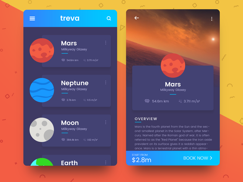
Planets-Flutter, a series of articles by Sergi & Replace in which he adapts a design to create a functional version of it using Flutter
I have to admit that although Oscar, one of hackers1 at Mobbeel, had been talking about Flutter for a long time, I didn’t pay much attention to him. Things have changed so much that I have even subscribed2 to one of the bulletins he recommended to me: Flutter Weekly.
And not only have I subscribed, I’m reading it. I even click on the innumerable links that each number contains3. For example, the third link of number 13 is a video in which they interview Eric Seidel, who is now director of the project. If you know what Flutter is little of what is said there will be interesting, but I found a hidden gem almost at the end of it, a mention without a link to a Spanish project. It is the Planets-Flutter series, from Sergi & amp; Replace, in which they use Flutter to create an interface like this:

In it Sergi takes us by the hand, showing us how to adapt a design and create a functional version of it using Flutter. Each article of the series covers one of the aspects of the adaptation: the navigation bar, the selection of colors, the creation of cells, and so on. A true delight, a unique opportunity to learn to use Flutter and create attractive designs, out of the ordinary.
Although for years I repudiated the existing multiplatform solutions, someone made me appreciate some of the benefits of them. I think I accepted Flutter with open arms thanks to that intermediate step. Well, and also because it is the first of these solutions that seems really native4.
If this is what can be achieved with Flutter in its beta version, I am looking forward to seeing what they achieve when it is stable.
- Good hacker, do not confuse with cracker. ↩
- I can not stand the bulletins; existing [RSS][resurge-rss], why would I want to use something else to be aware of everything? Luckily Flutter Weekly is sent through MailChimp, so I read it every week on Feedly. ↩
- Since Flutter entered the beta phase of its development, its popularity has grown so much that it is not difficult to find content, that is clear. Here is my main criticism of Flutter Weekly: too many links. Maybe they should be more picky about what they include in each number, that would add value to the newsletter. ↩
- In iOS it seems native except for some details of the material design of Google that slip through the cracks. ↩

